US President Donald Trump will be remembered for many things, but something few expected him to achieve would be to turbo-charge the uptake of battery electric vehicles (BEVs) and accelerate the transition to clean energy.
Trump’s “4-to-5 week” war on Iran started on 28 February and is still unresolved more than 6 months later. Not only did it immediately cause a global oil shock and big rises in the price of petrol and diesel at the pump, new car dealers in Australia were inundated with people suddenly looking to purchase a new car – particularly BEVs or plug-in hybrids (PHEVs).
The results were spectacular – new records for BEV sales were set in March, April, May, June, pulled back slightly as expected in July, and then set a new record again in August with 24.9% of all new vehicles sold being battery electric.
With 6 months of data under the belt, it’s time to do a deep-dive on where the growth in BEV uptake has been the most spectacular – and the results are eye-opening.
Not all growth is created equal
Granular data on EV uptake is available in NSW from the excellent Transport for NSW Registration Snapshot Report which is updated daily. Unfortunately, the other states don’t provide this level of detail as frequently, but the patterns seen in NSW are likely to be similar in other states.
NSW has 128 local government areas (LGAs) and the number of BEVs registered in each LGA can be tracked over time from the TfNSW report.
Dividing the total number of BEVs in each LGA by the number of BEVs registered there 6 months prior yields a simple growth percentage. The result? Every LGA in NSW has seen a growth in the number of BEVs, from 11% in Lachlan LGA in the central west of NSW to a remarkable doubling (110%) in Kempsey LGA on the mid north coast.
Job done? Not quite, because the starting point in each LGA varies by two orders of magnitude, and that matters.
New technology uptake in its pre-mass-market phase is often characterised by what is called ‘power law’ adoption. This means the rate of growth is proportional to the current uptake raised to the power of some negative exponent. The higher the starting point, the slower the expected future growth rate, which continues to decline as the market becomes more saturated.
So not all growth is created equal. Which is more impressive – doubling the number of BEVs in a region from 50 to 100, or increasing them by 20% from 5000 to 6000? Not only is the starting point in raw numbers important, but also what it’s relative to as every region is a different size.
So, the first task was to produce the scattergram of Figure 1 which shows the 6-month percentage growth in BEVs for every NSW LGA plotted against that LGA’s starting point – the percentage of the vehicle fleet that was already battery electric. A bit of statistical crunching yielded the dotted line which is the ‘best fit’ power law curve to the data.
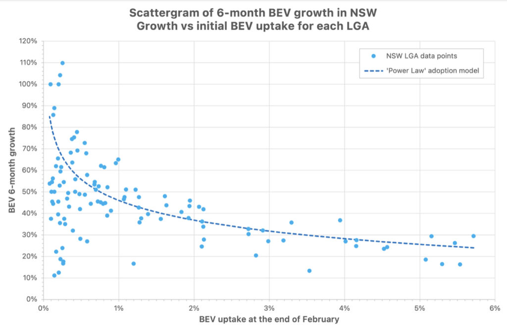
Figure 1 clearly shows that, on average, growth was much higher in areas with lower initial BEV uptake. Well done ‘power law’! But the data at low uptake levels (less than 1%) is also very ‘noisy’ and there are areas that grew a lot more than what might be expected based on the power law, and areas that grew a lot less.
Note the ‘power law’ is not intended to be a predictive tool but a mathematical description of the underlying growth process.
The regions are leading BEV growth
Deciding the point at which growth becomes statistically significant compared to some baseline is a bit of a dark art. But we can identify regions which grew a lot faster than what the power law would suggest.
Table 1 lists the top 10 LGAs in NSW ranked by their ‘Z score’ which is basically a measure of how far growth deviated from the ‘power law’ baseline taking into account raw BEV numbers, the uptake starting point, and the percentage growth in each area. The table also lists the median household weekly income in each area (2021 Census data). Income was ignored in the analysis, but provides context when looking at the results.
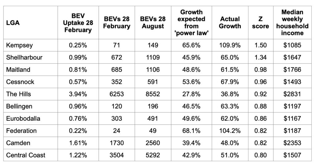
The results in Table 1 are interesting for a few reasons. First, only two of the top 10 LGAs are in metro Sydney (The Hills and Camden) – all the rest are regional.
Kempsey, on the NSW mid north coast, came out on top. Even though it is starting from a low base, its 110% growth rate was so large (as a raw percentage it was also #1) that it still statistically won the state. Kempsey also has the lowest median household income of the top 10.
Shellharbour, located between Wollongong and Kiama, is also a standout with BEV numbers having grown 65% and rocketing from 1% to 1.6% of the fleet in only 6 months. This is followed by Maitland and Cessnock in the Hunter Valley, both also growing by more than 60%.
It is clear – the regions are now where most ‘above expectation’ growth is occurring in electric vehicle adoption.
The two LGAs in the top 10 from Sydney metro are urban fringe commuter belt areas. The Hills is a wealthy area in the northwest that already had high BEV uptake to start with, but it added so many BEVs over the past 6 months (nearly 2300) that it still made the top 10. Camden, meanwhile, is in the outer southwest and grew its BEV fleet by nearly 50%.
At the other end of the scale, some areas with very low BEV uptake barely grew. Most of these LGAs were in the central west of NSW where battery EVs are a hard sell for a variety of reasons, even with an oil shock. But even some areas with high BEV uptake took a leisurely view of the fuel crisis.
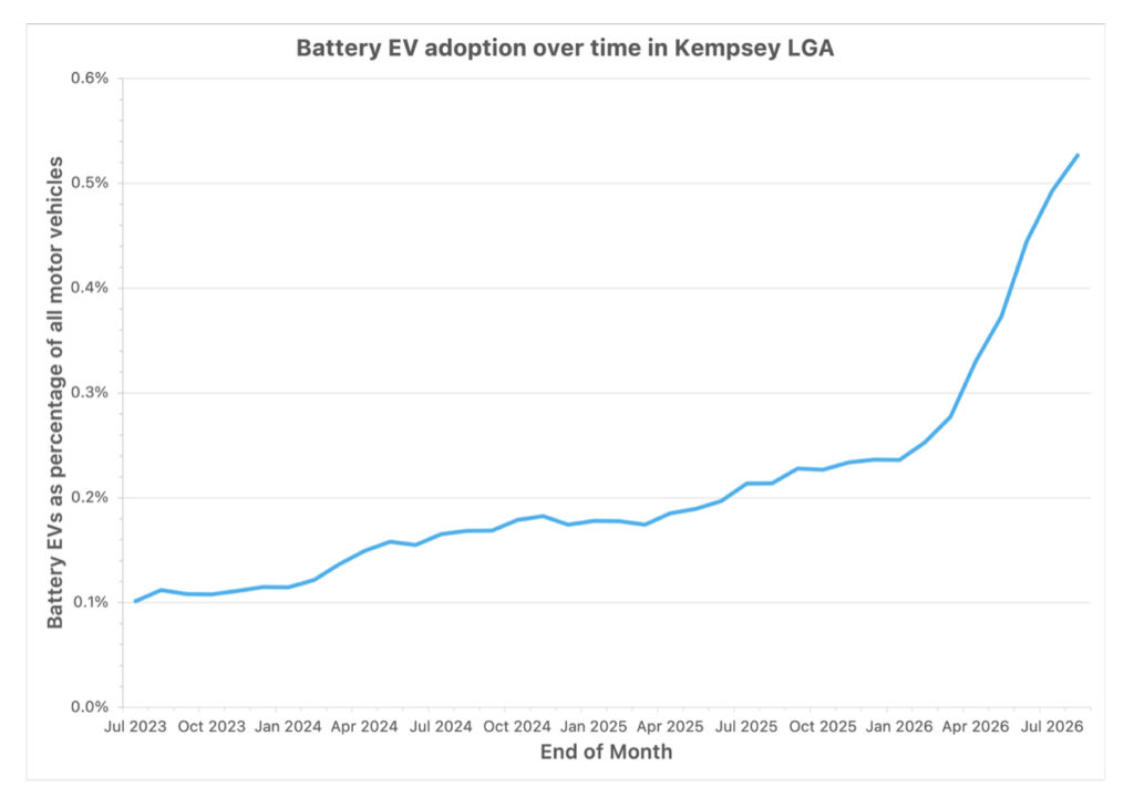
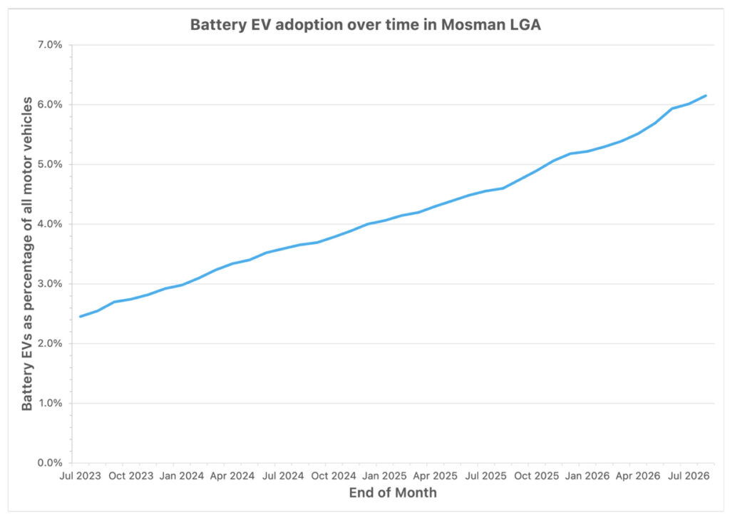
Figure 2(a) shows the increase in BEVs in Kempsey over the past 3 years and compares that with Mosman (Figure 2(b)), a wealthy area on the lower north shore of Sydney, which had one of the lowest 6-month growth rates in the state of 16%.
Kempsey’s chart shows the sudden change in BEV uptake coincided with the start of the war, and this increase has been sustained for 6 months. But the chart for Mosman barely shows a blip. Perhaps the residents of Mosman are not particularly sensitive to the price of fuel, given they have good access to public transport and are close to the city.
A map is worth a thousand words
Table 1 is interesting but a map is worth a thousand words when attempting to find some common ground among the areas that have grown the most.
Figure 3 is an interactive ‘heat’ map showing the raw 6-month growth rate in every LGA with no data tweaking. The reason for that is that if adjacent regions show similar growth rates (similar colour) it might suggest an area-wide effect is in play, even if the growth in one region on its own is not particularly significant or starting from a very low base.
The meaning of the different colours is as follows:
- • The growth rate is communicated by the LGA’s colour – from pale pink for the lowest growth rate (11%) to dark red for the highest (110%).
- • LGAs which have welcomed their first BEVs in the past 6 months are ‘debutants’ and are coloured yellow (as notionally their 6-month growth is infinite). There are six: Carrathool, Gilgandra, Gwydir, Lockhart, Moree Plains and Narromine.
- • LGAs with zero BEVs are mid-grey and have no growth rate (13 in total).
- • Unincorporated NSW is coloured light grey since this area covers both the Far West Area of NSW as well as Lord Howe Island – but the TfNSW report does not separate these two very different areas out. While the data for this total region is still shown, most of the BEVs are probably located on Lord Howe Island.
Individual LGAs in Figure 3 are also given a statewide rank based on their raw growth rate, but only if that LGA has either 100 or more BEVs, or has a BEV passenger vehicle uptake of 1% or higher. 78 LGAs meet that threshold. For the remaining LGAs the growth data is too noisy and it would not be meaningful to rank them.
This map provides a bit more insight – the fastest growing regions are north-eastern NSW, the Hunter/Upper Hunter region, and the Illawarra/South Coast. The Riverina/Murray region also has some areas with very high growth, but the raw numbers of BEVs there are generally very low so we can’t read too much into that yet.
By any measure these regions could not be described as the home of ‘inner city elites’. I’m no social researcher, but I’ll stick my neck out and hypothesise that the common thread appears to be areas within commuting / frequent-trip distance of the larger regional cities – exactly the areas where sensitivity to fuel prices is going to be very high.
NSW reaches 150,000 BEVs
In October last year NSW reached 100,000 BEVs and crossed the 150,000 mark on 21 August. Based on NSW’s historical share of the national BEV market, that implies there are now half a million BEVs nationally.
There are 35% more BEVs on NSW roads today than there were just 6 months ago – a staggering increase of 217 BEVs every single day. And in the passenger vehicle category, BEVs passed 3% of the passenger motor vehicle fleet on 13 August.
Figure 4 is an interactive map showing BEV uptake across NSW, with shading from light green for LGAs with the lowest BEV uptake to dark green for those with the highest. As at 31 August, Ku-ring-gai LGA remains in the #1 position with 7.38% of their fleet being battery electric – the first LGA to cross the 7% threshold.
The most common BEV make in NSW is still Tesla, with 59,901 vehicles as at 31 August. It is likely BYD is second but we can’t be definitive because the TfNSW registration report has BYD lumped in with “Others” at 46,123 and then MG third with 8367 BEVs.
A spokesperson for TfNSW said “Transport for NSW is currently undertaking analysis of vehicle manufacturer classifications within the Registration Snapshot Report, including consideration of manufacturers such as BYD, Polestar and Cupra” and “At this stage, TfNSW anticipates that any approved changes would be reflected in the Registration Snapshot Report before the end of 2026.”
That will be something to look forward to. Hopefully every manufacturer will be listed in an upgraded report, finally revealing the fleet numbers for some of the brands which seem reluctant to report their sales figures.